
Ticket Booking app for Fandango
I interned with Fandango during summer of 2015 (June - August), and was tasked to redesign its Android tablet app for ticket booking. The earlier app used to be an unresponsive version of their mobile app. It was an old version and it hadn't been updated with new features and design in over five years. I was given the responsibility of redesigning the app to be a one-stop solution for movie goers. The app was intended to help user's decide and book movie tickets without having to use any other source for gathering movie information.
Some of the major features in the redesigned application were:
- A feature to filter showtiming.
- Recommendations for movies based on genre.
- A map view theatre list.
- A way to share showtimings amongst group.
Design Process
Cognitive walkthrough - Analyzing the present Android tablet app
We started the process by conducting a Cognitive walkthrough of the present application. This was aimed at finding the major faulty areas of the application. It gave us an idea about what has been there in the previous app and what features are to be redesigned. Some of the main problematic areas in Movie Overview Page were:
- The swiping feature for the desk of photo cards wasn't intuitive for the user. The cards for the movie cast information, photos and trailers were arranged in the form of a deck of cards (piled up on each other). The user had to swipe through the layers of cards. This swiping action was not natural for the user and this kind of arrangement displayed only one information card at any point.
- There was no movie synopsis on the movie overview page. Movie synopsis was the summary of the movie plot. It helped users take decisions while selecting a movie.

User Study
Once we were done with cognitive walkthrough, we decided to study user reaction to the old application. We wanted to rapture user's view about the application. We had video recordings of participants using the app. The users were instructed to perform certain tasks in the application. We took notes for the difficulties faced by the participants and their suggestions for the app. We tried capturing their thought process with Think-aloud sessions. Some of the major findings from this user study were:
- Users preferred a catalog view for the movie display page i.e. posters for all the movie options displayed together. In this arrangement, they had all the options displayed right in front of them.
- Users could not distinguish between Fan Reviews and Critic Reviews. Generally, the users are exposed to only one kind of movie review ( which they don't know if they are fan review or critic review). So when they saw these two forms of reviews on old application, they felt confused and didn't know which one to rely upon.
- Users liked all the information on a single tab for the Movie Overview Page. They did not like the version of the application where we had different tabs for movie trailers, photos and videos.
Empathy Mapping with stakeholders.
Empathy Mapping is an activity of collaboration amongst several stakeholders, where they think about what each persona thinks, feels, sees, says and hear related to the application. This includes user's pains and gains as well.
We conducted this activity with our major collaborators, like product managers, visual designers, other UX designers and developers. This activity helped discover several different perspectives. It kept our stakeholders interested and helped us get them on the same page. Some of the insights from this activity assisted us in refining our personas better. Insights included ideas like:
- Introducing information about the nearby restaurants for the undergraduate students persona.
- Including movie news for the Movie Buff persona.

User Flows - to capture transitions and surrounding environment
User flows are devised to help designers go through different use case scenarios from a user's perspective. It helps them realize user needs and user thought process. We created user flows for all of our personas and these user flows were describing the process flow for each of the major use case scenarios.

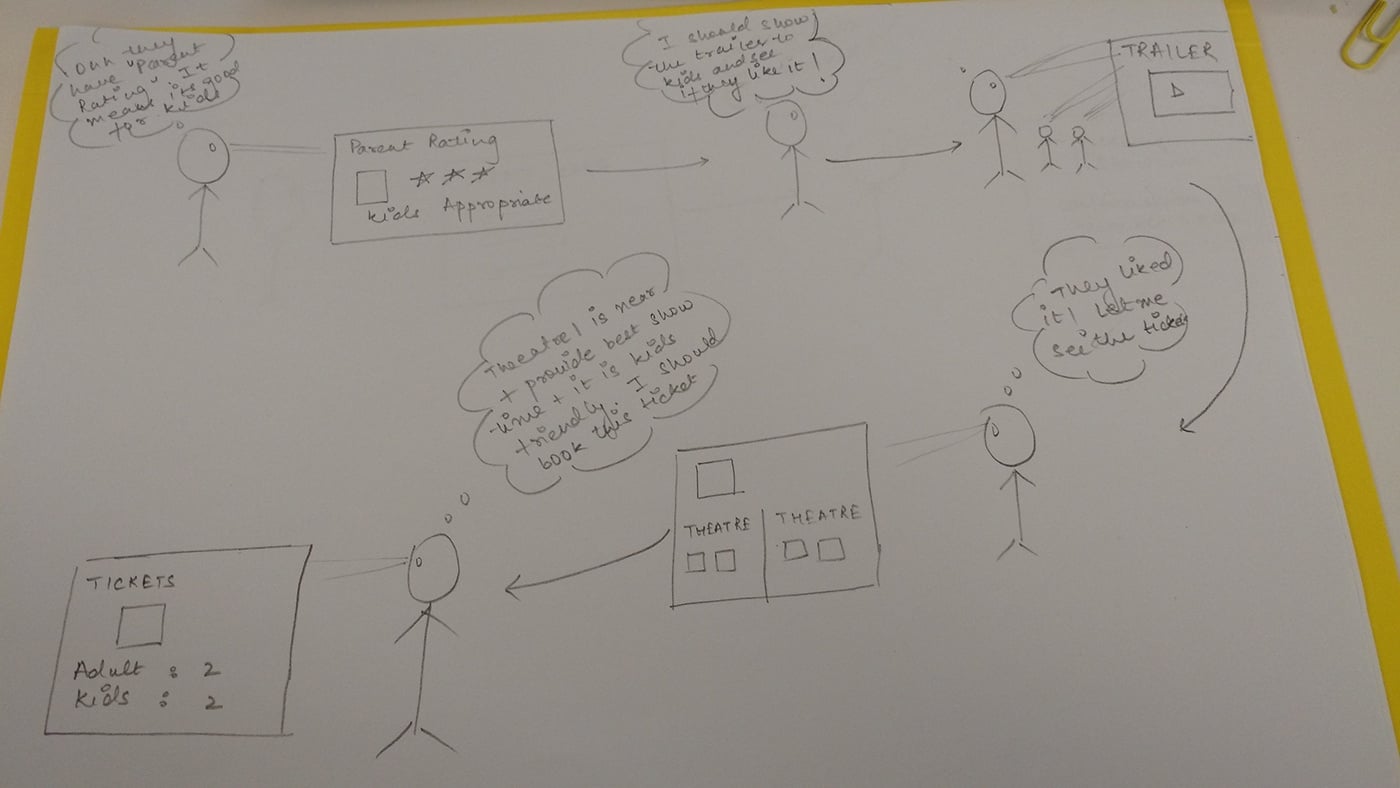
Field Work - a movie outing with the design team.
Till now, we had been staying in a controlled environment and taking all our decisions. Now we decided to conduct a field study, where a team of designers and other stakeholders went out for a movie. We used the Fandango app to discuss, negotiate and decide the movie and showtimings. After booking the tickets, we went to watch that movie. During this entire process, we took notes of obstacles and facilities which can enhance our user experience. This activity helped us realize the practical pitfalls and requirements of the user. It led us recognize the various places where the app could help users in take better decisions.
Example: Map with a picture of the theatre cab help users recognize the theatre faster.

Sitemap - Exploring information hierarchy (using Omnigraffle)
Sitemaps are used to describe the architecture of the information system. It helps us organize content and create a smooth flow of information. Developing sitemaps for this application helped us get a clear picture of the entire information flow. It helped us categorize data according to various user tasks and user thought processes.

Sketching - Quick and Iterative way to bring everything together
Sketching provides me a way to combine all the data gathered till now into one concrete design. All that data was gathered to help inform the design. We sketched several alternatives of most of the screen. Then those alternatives were analyzed and discussed amongst designers. This was done through Design Charette. Once the sketches were discussed and analyzed amongst the designers, appropriate changes were made to the designs.

Sketch I
Requirements:
Theatre Page- A page to display information for a particular theater.
User Study:
- User testing showed that dates displayed in calendar formats reduce booking errors.
- Sometimes user need theater informations details before making their decision. Theater Information may include: address, map and driving directions, accessibility information etc.
Design:.
- In order to help user decide, we made theater location and map information explicit.
- Dates were displayed in calendar formats.
- The most popularly searched showtimings were made easily accessible.
- Accessibility options were included in screen design.

Sketch II:
Requirements:
A list of theater and movies.
User Study:
- Users have nearest or favorite theaters.
- Users remember theaters by their location more often than by their names.
- Theater and movie selection is interdependent.
Design:
- Including map and location information in theatre list helps in decision making.
- The most frequently used theaters are displayed prominently .
- Minimal movie and theater information to maximize space utilization.
Prototypes to communicate ideas
Prototypes help designers test their ideas about what looks good and what fits the need of the users. It can help them convey their ideas to the developer as well. We used a software called Axure RP to develop our prototypes. During this process, we were involved in an iterative loop of feedbacks, modifications and validations.

Prototype I
Requirement:
A map view of the nearby theaters and movie show times.
User Study:
- Location and distance information are important components of movie selection.
- Users commonly search and filter out movie showtimings manually.
Design:
- We created two views for the theatre listing screen. The user can select either List view or the Map view. Map view displayed all the nearby theaters on a google map. Switching to different pins on the map would populate the movie and location information for that particular theater.
- New features to search for the movie timings was added as the Action button and another feature to enable filtering based on date and time of the day.

Prototype II
Requirement:
Movie overview page (MOP).
User study:
- Participants from user studies showed clear preference for displaying all movie information on a single screen as compared to tabbed information.
- Time constrains were a major factor in movie decision.
- Distributed groups share show timings before taking decisions.
- Movie genre is one of the important factors of movie decisions.
Design:
- MOP was designed to display all movie information on a single screen. The content was subject to change with user interaction. Screen was designed to hide movie synopses and photos, once the user goes below the fold (to consume theater and movie timing information) .
- Time based filter was introduced to refine the movie timing results. Users can input date and time range for search for specific show times.
- Share button was introduced to share movie timings.
- Recommendation for similar movies was added to the end of the screen.
Major take-away points:
Designers can learn a lot by observing the user while they use the product and by going through the process of using your application as a consumer. All the UX process are just a way to get better understanding for your product consumers and their surroundings.